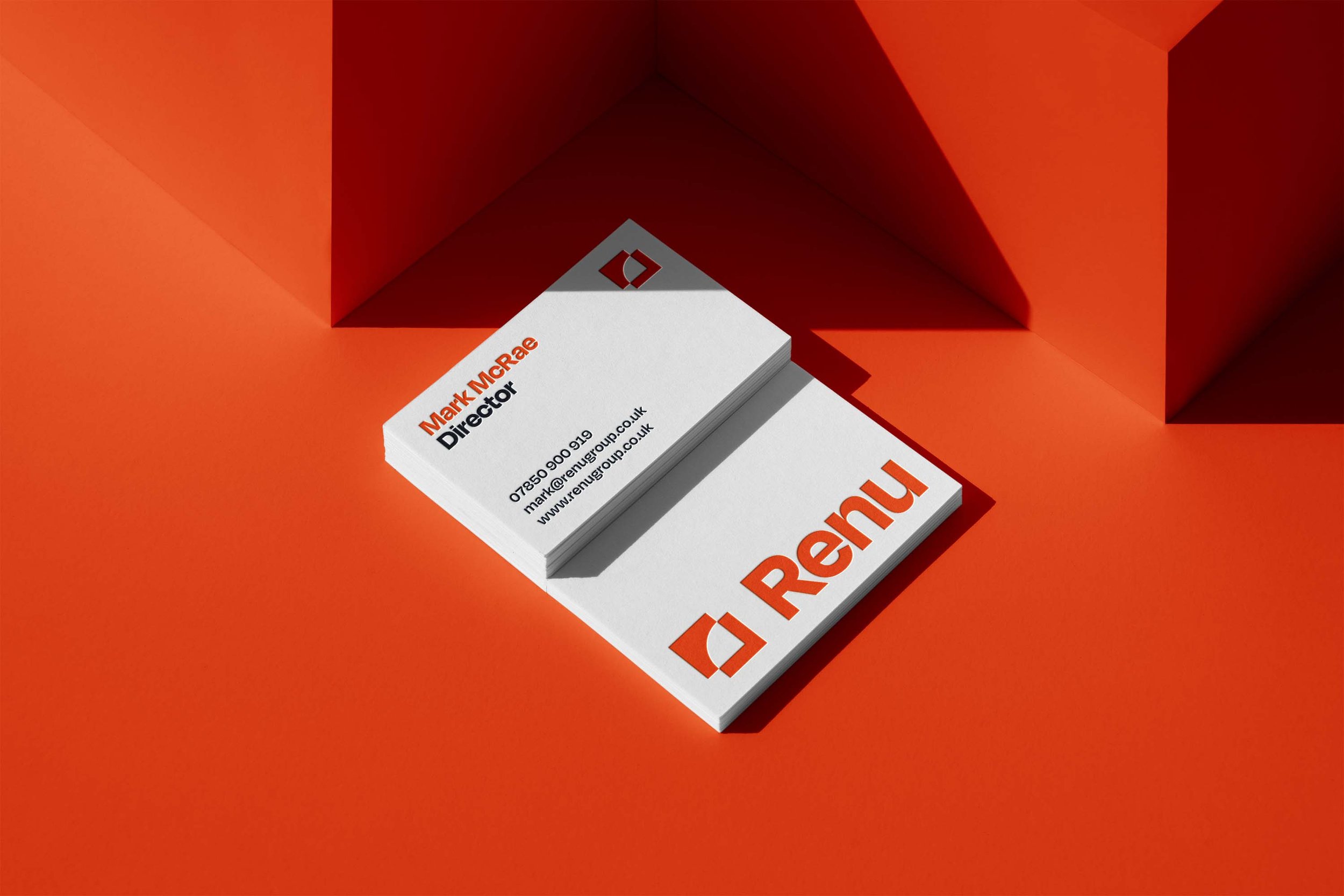
Renu
Rebranding a master tradesman.
Project Overview
In 2022 I was approach by Mark McRae, owner of Arc Plastering. His business was growing and required a brand that reflected his wider service offering. They required a new company name, brand identity and website.
New logo
Original logo
Creating a new name
Mark’s business was changing. He was now diversifying to offer a range of new services such as stove fitting and soundproofing. We undertook a series of workshops to create a name that encompassed everything the business was now offering customers, whilst maintaining the defining features that had made Mark’s business a success up to that point.
The name we settled upon was ‘Renu’. Throughout our sessions, it became apparent that one of Mark’s key selling points is his ability to revitalise and reinvigorate the spaces he works in.
Mark isn’t just a master at his craftsman - he also brings a creative approach to refreshing homes and spaces, providing solutions that customers hadn’t considered or expected. The name ‘Renu’ felt simple, down-to-earth and self-explanatory.

Brand Development
With the new name finalised, we moved onto creating concepts for the new brand. The brand had to visualise everything Mark and his team were known for, years of dedication to their craft, reliability and a down-to-earth, polite temperament that has led to an outstanding local reputation. It also had to feel modern and slick enough to reflect their creative solutions

Renu Your Home
A brand tagline was developed to succinctly encapsulate the value Renu bring to customers home. The ‘Renu your home’ tagline was applied to company vehicles to enhance brand recognition.

Digital Application
A brochure website was developed using Squarespace. As part of this, a set of illustrations were designed to visualise Renu’s services. A range of social media templates were also produced.
Visit their website: renugroup.co.uk


If you have a project in mind or would like some honest advice on your brand, let’s talk. Send me an email: hi@sampetyt.co.uk