Parkhead Primary School
Branding a unique place for learning.

Project Overview
Parkhead Community Primary School, based in Winlaton, Gateshead, asked me to help them strengthen their visual communication within their community. This project involved a brand new school logo and visual identity for the school.
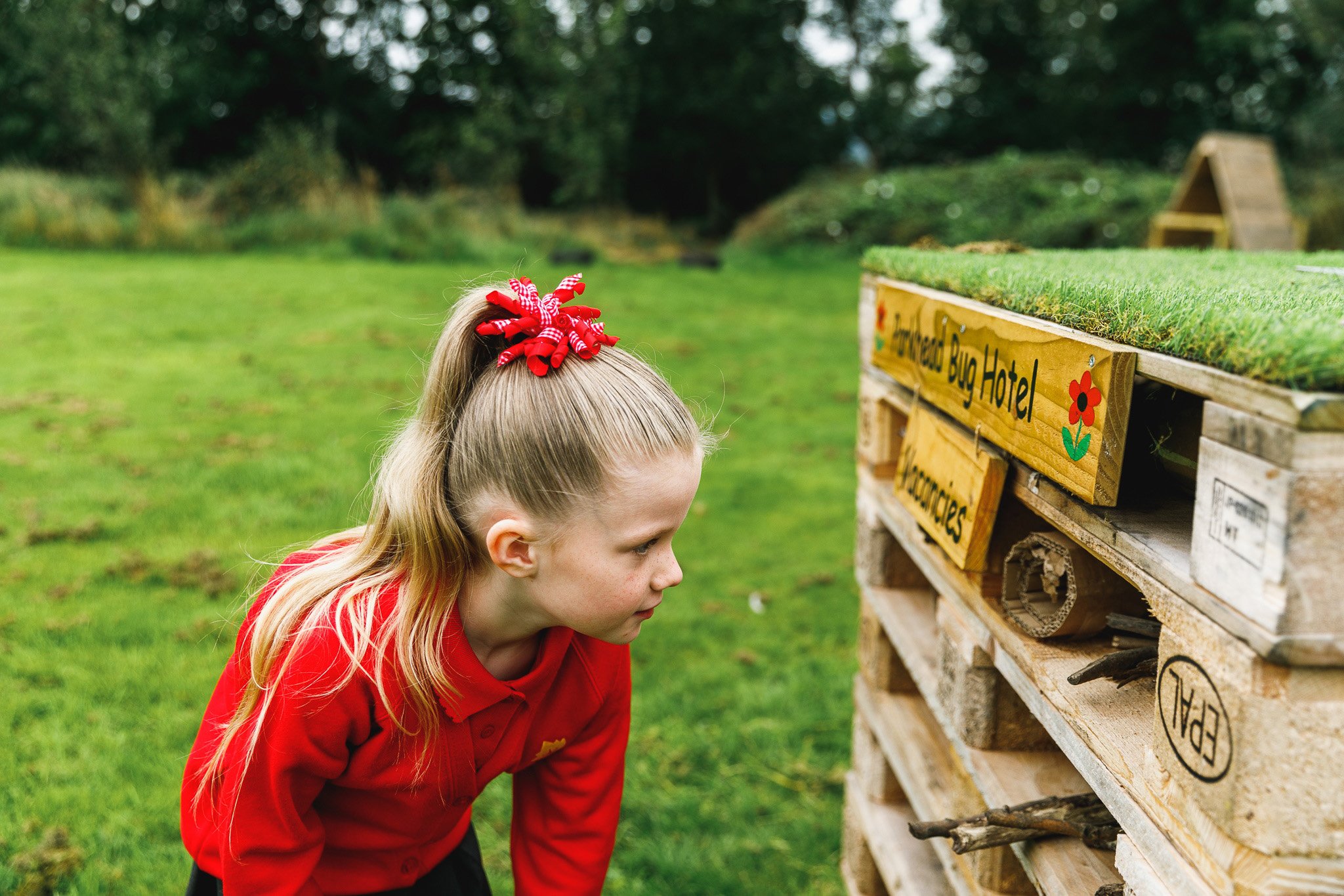
To stand out from the surrounding Schools, Parkhead needed to define what makes them unique. Based on the collated research of staff, governors and parents, it was clear that emphasis needed to be placed on the school’s outdoor spaces, particularly their Forest School facilities.
The brand needed to reflect the school’s dedication towards nurturing and supporting pupils, giving them the best start possible.
Brand Development
With a wealth of valuable research, I began work creating the first round of design concepts. The focus on this first stage was to create work that visualised phrases such as a ‘bright future’ or a ‘pathway to success for the children, using the outdoors as inspiration. The existing school logo included a tree, and the school was keen to see how this existing concept could be updated.
The existing colour palette was mainly red and blue. The uniform was red, and there was a strong desire to maintain this colour, as it was very recognisable within the community. But with the focus on promoting the forest school, the school decided that 'forest school' related colours should be used within the colour palette.

Like many branding projects, at first, you don’t always hit the nail on the head. The initial concepts were considered too complex and targeted too closely toward nursery-age children. A more minimal, conceptual approach was needed.
The next round of concepts produced three different approaches. Each one aimed to visualise the forest school, using the elements of a tree in different ways. The chosen idea used three leaves common to the local area to create the letter ‘P’. The leaves symbolised the staff, parents and wider community coming together for the good of the children at Parkhead. And like every child, each leaf is unique, but at Parkhead, they’re allowed to thrive. And finally, the logo promoted the school’s Forest School initiative.

“The outcome of the rebrand is fantastic and it has been such a worthwhile journey for us.”
Catherine Bulman, Parkhead Business Manager


Brand Application
Once the brand identity was visualised, brand guidelines were produced as well as wide of range of touchpoints. These included the school uniform, for both staff and pupils, stationary and a wide range of signage. The school website was designed and developed by Juniper education.
Visit their website: parkheadprimary.org


If you have a project in mind or would like some honest advice on your brand, let’s talk. Send me an email: hi@sampetyt.co.uk